modern_date_picker
A beautiful, customizable date picker widget for Flutter with modern calendar UI, dark/light theme support, optional time picker, and full localization.

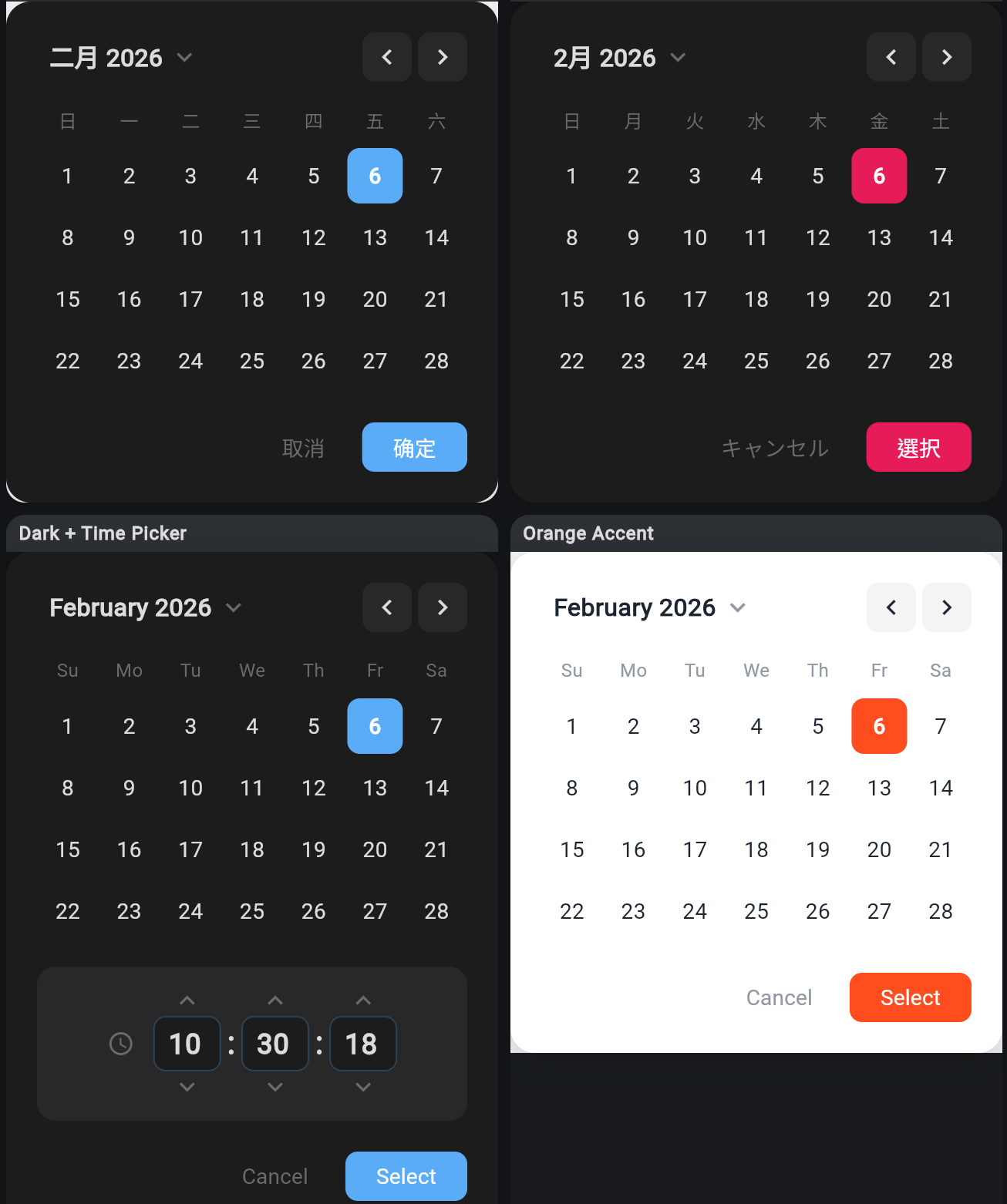
Demo
Features
- Modern calendar UI with smooth month navigation
- Month/year quick selector dialog
- Today highlighting with accent border
- Date range constraints (min/max selectable dates)
- Optional 24-hour time picker (HH:MM:SS) with keyboard input
- Built-in light and dark themes
- Fully customizable accent colors via
copyWith - Custom weekday and month labels for any language
- Custom cancel/select button labels
- Zero external dependencies (only Flutter SDK)
Getting Started
Installation
Add modern_date_picker to your pubspec.yaml:
dependencies:
  modern_date_picker: ^0.1.0
Then run:
flutter pub get
Import
import 'package:modern_date_picker/modern_date_picker.dart';
Usage
Basic Date Picker
final date = await CustomDatePickerDialog.show(
  context: context,
  initialDate: DateTime.now(),
);

if (date != null) {
  print('Selected: $date');
}
Date & Time Picker
Enable the 24-hour time selector with showTimePicker:
final dateTime = await CustomDatePickerDialog.show(
  context: context,
  initialDate: DateTime.now(),
  showTimePicker: true,
);

// dateTime includes both date and time:
// e.g. 2026-02-06 13:20:22
Dark Theme
CustomDatePickerDialog.show(
  context: context,
  initialDate: DateTime.now(),
  theme: CustomDatePickerTheme.dark,
);
Custom Accent Color
CustomDatePickerDialog.show(
  context: context,
  initialDate: DateTime.now(),
  theme: CustomDatePickerTheme.light.copyWith(
    accentColor: Colors.purple,
  ),
);
Date Range Constraints
final now = DateTime.now();
CustomDatePickerDialog.show(
  context: context,
  initialDate: now,
  firstDate: now,
  lastDate: now.add(const Duration(days: 7)),
);
Localization
Customize all labels for any language:
CustomDatePickerDialog.show(
  context: context,
  initialDate: DateTime.now(),
  weekDayLabels: const ['日', '月', '火', '水', '木', '金', '土'],
  monthLabels: const [
    '1月', '2月', '3月', '4月', '5月', '6月',
    '7月', '8月', '9月', '10月', '11月', '12月',
  ],
  cancelLabel: 'キャンセル',
  selectLabel: '選択',
);
API Reference
CustomDatePickerDialog
| Parameter | Type | Default | Description |
|---|---|---|---|
initialDate |
DateTime |
required | Initially selected date |
firstDate |
DateTime |
DateTime(1900) |
Earliest selectable date |
lastDate |
DateTime |
DateTime(2100) |
Latest selectable date |
theme |
CustomDatePickerTheme? |
auto from brightness | Theme configuration |
weekDayLabels |
List<String>? |
['Su','Mo',...] |
Custom weekday labels (starting Sunday) |
monthLabels |
List<String>? |
['January',...] |
Custom month labels |
cancelLabel |
String |
'Cancel' |
Cancel button text |
selectLabel |
String |
'Select' |
Select button text |
showTimePicker |
bool |
false |
Show 24-hour time picker (HH:MM:SS) |
CustomDatePickerTheme
| Property | Type | Description |
|---|---|---|
backgroundColor |
Color |
Dialog background |
textColor |
Color |
Primary text color |
mutedColor |
Color |
Secondary/muted text color |
accentColor |
Color |
Selected item and button color |
hoverColor |
Color |
Hover/highlight background |
Presets: CustomDatePickerTheme.light, CustomDatePickerTheme.dark
Factory: CustomDatePickerTheme.fromBrightness(Brightness) - auto-select based on system theme.
MonthYearPickerDialog
A standalone month/year selector dialog, also used internally by the date picker.
final date = await MonthYearPickerDialog.show(
  context: context,
  selectedDate: DateTime.now(),
  theme: CustomDatePickerTheme.light,
);
Example
A full example app is included in the example/ directory with demos for:
- Basic usage
- Custom themes (light, dark, accent colors)
- Date range constraints
- Date & time picker
- Localization (Chinese, Japanese, and more)
- Showcase page with all variants at a glance
Run the example:
cd example
flutter run
License
This project is licensed under the MIT License - see the LICENSE file for details.
Libraries
- modern_date_picker
- A beautiful, customizable date picker widget for Flutter.