M3E Card List

A comprehensive Flutter package that combines 5 expressive Material 3 libraries into one robust bundle: Card Lists, Dismissible Cards, Expandable Cards, Dropdown Menus, and Extended M3 Shapes. It brings the new Material 3 Expressive styling to your app with dynamic border radii, beautiful spring physics, and tailored sliver support out of the box.
Whether you need a simple static list, swipe-to-dismiss functionality with "neighbour pull" mechanics, animated expandable cards, a highly customizable dropdown menu with chip selections, or beautifully crafted M3 shapes, this unified package gives you robust customization options—from haptic feedback and custom border colors to tunable stiffness and damping for all animations.
📦 Individual Packages
This package (m3e_core) contains all the M3E components bundled together. If you only need a specific component, you can use the individual packages:
📦 Installation
dependencies:
  m3e_core: ^0.0.2
import 'package:m3e_core/m3e_core.dart';
🧩 Components & Usage
1. Basic M3E Card List
Use for static or simple scrollable interactive card lists.

Usage:
M3ECardList(
  itemCount: 5,
  itemBuilder: (context, index) {
      return Text('Data Item $index');
  },
  onTap: (index) => print('Tapped $index'),
  haptic: 3, // 0: None, 1: Light, 2: Medium, 3: Heavy
);
Constructor Parameters:
| Parameter | Type | Description |
|---|---|---|
itemCount |
int |
Number of items in the list. |
itemBuilder |
IndexedWidgetBuilder |
Builds the widget for each index. |
outerRadius |
double |
Radius for the cap corners of the first/last items. |
innerRadius |
double |
Radius for the inner corners of adjoining items. |
gap |
double |
Spacing between items. |
color |
Color? |
Background color of the cards. |
padding |
EdgeInsetsGeometry? |
Inner padding for each card. |
margin |
EdgeInsetsGeometry? |
Outer margin for the cards. |
onTap |
void Function(int)? |
Item tap callback. |
border |
BorderSide? |
Border drawn around each card. |
elevation |
double |
Elevation of the card. |
splashColor |
Color? |
Ink splash color on tap. |
highlightColor |
Color? |
Ink highlight color on tap. |
splashFactory |
InteractiveInkFeatureFactory? |
Splash factory (e.g. NoSplash.splashFactory). |
enableFeedback |
bool |
Whether gestures provide acoustic/haptic feedback. |
haptic |
int |
Haptic intensity on tap (0=none, 1=light, 2=medium, 3=heavy). |
Variants Available:
SliverM3ECardList,M3ECardColumn
2. M3E Dismissible Cards
Swipe-to-dismiss items with a beautiful spring-driven "neighbour pull" effect.
🔴 Dismissible M3E (Gmail Style)

🔴 Dismissible M3E (neighbourPull: 50.0, neighbourReach: 3, stiffness: 500, damping: 0.25, dismissThreshold: 0.6)

Usage:
M3EDismissibleCardList(
  itemCount: items.length,
  itemBuilder: (ctx, i) => Text(items[i].title),
  onDismiss: (i, dir) async {
    items.removeAt(i);
    return true;
  },
  style: const M3EDismissibleCardStyle(
    outerRadius: 24,
    dismissThreshold: 0.3,
    neighbourPull: 12.0,
  ),
)
M3EDismissibleCardList Parameters:
| Parameter | Type | Description |
|---|---|---|
itemCount |
int |
Number of data items. |
itemBuilder |
IndexedWidgetBuilder |
Builds content for each item. |
onDismiss |
Future<bool> Function(int, DismissDirection)? |
Called when swipe exceeds threshold. Return true to dismiss. |
onTap |
void Function(int)? |
Called on tap (blocked during drag). |
style |
M3EDismissibleCardStyle |
Visual and interaction configuration. |
physics |
ScrollPhysics? |
Scroll physics override. |
scrollController |
ScrollController? |
Scroll controller. |
listPadding |
EdgeInsetsGeometry? |
Padding around the entire list. |
shrinkWrap |
bool |
Whether the list should shrink-wrap its children. |
clipBehavior |
Clip |
Clip behavior for the list. |
M3EDismissibleCardStyle Parameters:
| Parameter | Type | Description |
|---|---|---|
outerRadius |
double |
Outer corner radius for first/last/single items. |
innerRadius |
double |
Inner corner radius for middle items. |
selectedBorderRadius |
double? |
Radius applied to the dragged card once threshold is crossed. |
backgroundBorderRadius |
double? |
Radius applied to the background when swiping start-to-end. |
secondaryBackgroundBorderRadius |
double? |
Radius applied to the secondary background when swiping end-to-start. |
collapseSpeed |
double |
Speed of collapse animation after the card is dismissed. Higher Number = Faster Collapse, Lower Number = Slower Collapse |
gap |
double |
Vertical gap between cards. |
color |
Color? |
Card background colour. |
padding |
EdgeInsetsGeometry? |
Inner padding of each card's content area. |
margin |
EdgeInsetsGeometry? |
Outer margin around each card. |
border |
BorderSide? |
Optional border drawn on every card. |
elevation |
double |
Resting elevation. |
background |
Widget? |
Revealed background when swiping start-to-end. |
secondaryBackground |
Widget? |
Revealed background when swiping end-to-start. |
splashColor |
Color? |
Ink splash color. |
highlightColor |
Color? |
Ink highlight color. |
splashFactory |
InteractiveInkFeatureFactory? |
Splash factory. |
enableFeedback |
bool |
Whether gestures provide acoustic/haptic feedback. |
hapticOnTap |
int |
Haptic intensity on tap (0=none, 1=light, 2=medium, 3=heavy). |
dismissThreshold |
double |
Fraction of width before dismiss triggers. |
hapticOnThreshold |
int |
Haptic feedback level when crossing dismiss threshold. |
dismissHapticStream |
bool |
Fire continuous light haptics during drag. |
neighbourPull |
double |
Maximum pixel offset applied to neighbouring cards. |
neighbourReach |
int |
How many cards above + below the dragged card are affected. |
neighbourStiffness |
double |
Spring stiffness for neighbour snapping. |
neighbourDamping |
double |
Spring damping for neighbour snapping. |
Variants Available:
SliverM3EDismissibleCardList,M3EDismissibleCardColumn
3. M3E Expandable Cards
Smoothly expand and collapse individual cards using motor spring animations.
🔴 Expandable M3E (Without selectedBorderRadius, allowMultipleExpanded: true)

🔴 Expandable M3E (With selectedBorderRadius, allowMultipleExpanded: true)

Usage:
M3EExpandableCardList(
  itemCount: 10,
  allowMultipleExpanded: true,
  headerBuilder: (context, index, isExpanded) => Text('Header $index'),
  bodyBuilder: (context, index) => Text('Body content for $index'),
)
Constructor Parameters:
| Parameter | Type | Description |
|---|---|---|
itemCount |
int |
Number of expandable items. |
headerBuilder |
M3EExpandableHeaderBuilder |
Builds the always-visible header section. |
bodyBuilder |
M3EExpandableBodyBuilder |
Builds the hidden, expandable body section. |
allowMultipleExpanded |
bool |
If true, allows multiple items to be expanded simultaneously. |
initiallyExpanded |
Set<int> |
Indices of initially expanded items. |
outerRadius |
double |
Outer radius for first/last items. |
innerRadius |
double |
Inner radius for middle items. |
gap |
double |
Gap between cards. |
color |
Color? |
Background colour for each card. |
headerPadding |
EdgeInsetsGeometry? |
Padding inside each header. |
bodyPadding |
EdgeInsetsGeometry? |
Padding inside each body. |
margin |
EdgeInsetsGeometry? |
Outer margin around each card. |
border |
BorderSide? |
Border drawn around each card. |
elevation |
double |
Elevation of the card. |
selectedBorderRadius |
BorderRadius? |
Custom border radius for expanded items (spring-animated). |
showArrow |
bool |
Shows an animated dropdown arrow in the header. |
trailingIcon |
Widget? |
Custom trailing widget, replaces default arrow when provided. |
openStiffness |
double |
Spring stiffness for the expand animation. |
openDamping |
double |
Spring damping ratio for the expand animation. |
closeStiffness |
double |
Spring stiffness for the collapse animation. |
closeDamping |
double |
Spring damping ratio for the collapse animation. |
haptic |
int |
Haptic feedback level on tap (0=none, 1=light, 2=medium, 3=heavy). |
splashColor |
Color? |
Ink splash colour. |
highlightColor |
Color? |
Ink highlight colour. |
splashFactory |
InteractiveInkFeatureFactory? |
Splash factory. |
enableFeedback |
bool |
Whether gestures provide acoustic/haptic feedback. |
onExpansionChanged |
void Function(int, bool)? |
Called when an item is expanded or collapsed. |
The
M3EExpandableCardListvariant also acceptscontroller,physics,shrinkWrap, andpaddingfor scroll control.
Variants Available:
SliverM3EExpandableCardList,M3EExpandableCardColumn
4. M3E Dropdown Menu
A powerful, stylized dropdown with support for single/multi-selection, fuzzy search, async loading, and animated chip tags.
🔴 M3E Dropdown (With expandedBorderRadius)

🔴 M3E Dropdown (Without expandedBorderRadius, With Chips)

Usage:
Single-select
A basic dropdown selecting one item, with animated border radius transition.
M3EDropdownMenu<String>(
  items: [
    M3EDropdownItem(label: 'Apple', value: 'apple'),
    M3EDropdownItem(label: 'Banana', value: 'banana'),
    M3EDropdownItem(label: 'Cherry', value: 'cherry'),
  ],
  singleSelect: true,
  stiffness: 400,
  damping: 0.6,
  fieldDecoration: M3EDropdownFieldDecoration(
    hintText: 'Choose a fruit',
    borderRadius: BorderRadius.circular(12),
    expandedBorderRadius: BorderRadius.circular(28),
  ),
  dropdownDecoration: const M3EDropdownDecoration(containerRadius: 18),
  itemDecoration: const M3EDropdownItemDecoration(outerRadius: 18, innerRadius: 6),
  onSelectionChanged: (items) => print(items),
)
Multi-select + Search + Chips + Clear
Provides a search bar, animated chip display, and a clear-all icon.
M3EDropdownMenu<String>(
  items: fruitItems,
  searchEnabled: true,
  showChipAnimation: true,
  maxSelections: 7,
  fieldDecoration: M3EDropdownFieldDecoration(
    hintText: 'Pick up to 7 fruits',
    border: BorderSide(color: Theme.of(context).colorScheme.outline),
    showClearIcon: true,
  ),
  chipDecoration: M3EChipDecoration(
    maxDisplayCount: 3,
    borderRadius: BorderRadius.circular(33),
    openStiffness: 600,
    openDamping: 0.7,
    closeStiffness: 700,
    closeDamping: 0.4,
  ),
  searchDecoration: M3ESearchDecoration(
    hintText: 'Search fruits…',
    filled: true,
    borderRadius: BorderRadius.circular(24),
  ),
  itemDecoration: M3EDropdownItemDecoration(
    outerRadius: 24,
    innerRadius: 8,
    selectedIcon: Icon(Icons.check_rounded, color: cs.primary, size: 18),
  ),
  onSelectionChanged: (items) => print(items),
)
With Form Validation
Integrates seamlessly with Flutter's standard Form and validations.
Form(
  child: Column(
    children: [
      M3EDropdownMenu<String>(
        items: fruitItems,
        singleSelect: true,
        validator: (selected) {
          if (selected == null || selected.isEmpty) return 'Required';
          return null;
        },
        autovalidateMode: AutovalidateMode.onUserInteraction,
        fieldDecoration: M3EDropdownFieldDecoration(
          hintText: 'Required fruit',
          borderRadius: BorderRadius.circular(12),
          expandedBorderRadius: BorderRadius.circular(28),
        ),
        dropdownDecoration: const M3EDropdownDecoration(
          containerRadius: 24,
          header: Text("Pick a fruit"),
          footer: Text("Swipe to see more"),
        ),
        itemDecoration: const M3EDropdownItemDecoration(
          outerRadius: 24,
          selectedBorderRadius: 24,
          itemPadding: EdgeInsets.all(14),
        ),
        onSelectionChanged: (items) => print(items),
      ),
      ElevatedButton(
        onPressed: () => formKey.currentState!.validate(),
        child: const Text('Submit'),
      ),
    ],
  ),
)
Custom Selected Item Builder
Build custom chip-like representations for selected items.
M3EDropdownMenu<String>(
  items: fruitItems,
  showChipAnimation: true,
  haptic: 1,
  selectedItemBuilder: (item) {
    return Chip(
      avatar: Icon(Icons.check_circle, color: cs.primary, size: 18),
      label: Text(item.label),
      backgroundColor: cs.primaryContainer,
    );
  },
  chipDecoration: const M3EChipDecoration(
    openStiffness: 600,
    openDamping: 0.7,
    closeStiffness: 700,
    closeDamping: 0.4,
  ),
  onSelectionChanged: (items) => print(items),
)
Async Data Loading
Loads dropdown items asynchronously via a Future.
M3EDropdownMenu<int>.future(
  future: () async {
    await Future.delayed(const Duration(seconds: 2));
    return List.generate(
      10,
      (i) => M3EDropdownItem(label: 'User ${i + 1}', value: i + 1),
    );
  },
  singleSelect: true,
  fieldDecoration: const M3EDropdownFieldDecoration(
    hintText: 'Loading users…',
  ),
  onSelectionChanged: (items) => print(items),
)
Constructor Parameters:
| Parameter | Type | Description |
|---|---|---|
items |
List<M3EDropdownItem<T>> |
List of dropdown items. |
future |
M3EDropdownFutureRequest<T>? |
Async item provider (use .future() constructor). |
singleSelect |
bool |
Limits to a single choice if true. |
searchEnabled |
bool |
Displays a search bar inside the overlay. |
showChipAnimation |
bool |
Chips slide / pop when selections change. |
maxSelections |
int |
Maximum allowed selections. |
onSelectionChanged |
ValueChanged<List<M3EDropdownItem<T>>>? |
Called whenever the selection changes. |
onSearchChanged |
ValueChanged<String>? |
Called when the search text changes. |
controller |
M3EDropdownController<T>? |
Optional programmatic controller. |
enabled |
bool |
Whether the dropdown is enabled. |
containerRadius |
double |
Radius for the dropdown panel and field (when no field radius is set). |
fieldDecoration |
M3EDropdownFieldDecoration |
Stylize the field placeholder, background, hint text, and icons. |
dropdownDecoration |
M3EDropdownDecoration |
Stylize the overlay panel height, colors, and shadow. |
chipDecoration |
M3EChipDecoration |
Stylize the chips, spacing, and pop animations. |
searchDecoration |
M3ESearchDecoration |
Stylize the search field inside the dropdown. |
itemDecoration |
M3EDropdownItemDecoration |
Stylize individual dropdown items. |
itemBuilder |
M3EDropdownItemBuilder<T>? |
Custom builder for each dropdown item. |
selectedItemBuilder |
Widget Function(M3EDropdownItem<T>)? |
Custom builder for selected items in the field. |
itemSeparator |
Widget? |
Widget placed between dropdown items. |
validator |
String? Function(List?)? |
Form validation callback. |
autovalidateMode |
AutovalidateMode |
Autovalidate mode for form integration. |
focusNode |
FocusNode? |
Focus node for the dropdown field. |
closeOnBackButton |
bool |
Close the dropdown on system back button press. |
stiffness |
double |
Spring stiffness for expand/collapse animation. |
damping |
double |
Spring damping for expand/collapse animation. |
splashFactory |
InteractiveInkFeatureFactory? |
Splash factory for tap feedback. |
haptic |
int |
Haptic feedback level on tap (0=none, 1=light, 2=medium, 3=heavy). |
M3EDropdownFieldDecoration Parameters:
| Parameter | Type | Description |
|---|---|---|
hintText / hintStyle |
String? / TextStyle? |
Placeholder text and its style. |
selectedTextStyle |
TextStyle? |
Style for the selected value text (single-select). |
prefixIcon / suffixIcon |
Widget? |
Optional leading/trailing widgets. |
backgroundColor / foregroundColor |
Color? |
Colors for the field. |
padding / margin |
EdgeInsetsGeometry |
Inner content padding and outer margin. |
border / focusedBorder |
BorderSide? |
Resting and focused borders. |
borderRadius / expandedBorderRadius |
BorderRadius? |
Resting radius, and animated radius when open. |
showArrow |
bool |
Shows default animated chevron. |
showClearIcon |
bool |
Shows clear-all icon when selections exist. |
animateSuffixIcon |
bool |
Rotates suffix icon when expanded. |
loadingWidget |
Widget? |
Widget shown while async loading. |
M3EDropdownDecoration Parameters:
| Parameter | Type | Description |
|---|---|---|
backgroundColor |
Color? |
Background color of the dropdown panel. |
elevation |
double |
Dropdown panel elevation. |
maxHeight |
double |
Maximum height bounds for the panel. |
marginTop |
double |
Gap between the field and panel. |
expandDirection |
ExpandDirection |
Extends up, down, or auto based on screen space. |
containerRadius |
double? |
Overrides the menu's containerRadius. |
contentPadding |
EdgeInsetsGeometry |
Inner padding for the list items. |
noItemsFoundText |
String |
Text when search yields nothing. |
header / footer |
Widget? |
Widgets placed above/below the items inside the panel. |
M3EChipDecoration Parameters:
| Parameter | Type | Description |
|---|---|---|
backgroundColor |
Color? |
Chip background color. |
labelStyle |
TextStyle? |
Text style for the chip. |
deleteIcon |
Widget? |
Custom widget for deletion icon. |
padding |
EdgeInsetsGeometry |
Inner chip padding. |
border / borderRadius |
BorderSide? / BorderRadius |
Borders and radii (Radius.circular(20)). |
wrap |
bool |
Wraps chips instead of horizontal scroll. |
spacing / runSpacing |
double |
Horizontal & vertical distance between chips. |
maxDisplayCount |
int? |
Shows "+N more" if exceeding max count. |
openStiffness / openDamping |
double |
Spring mechanics for entry (scale-in). |
closeStiffness / closeDamping |
double |
Spring mechanics for exit (scale-out). |
M3ESearchDecoration Parameters:
| Parameter | Type | Description |
|---|---|---|
hintText |
String |
Hint text shown in the search field. |
hintStyle |
TextStyle? |
Search field hint style. |
textStyle |
TextStyle? |
Search field text style. |
fillColor |
Color? |
Fill color for the search field. |
filled |
bool |
Whether the search field is filled. |
autofocus |
bool |
Auto-focus the search field when the dropdown opens. |
showClearIcon |
bool |
Whether to show a clear-search icon. |
clearIcon |
Widget? |
Custom clear icon widget. |
searchDebounceMs |
int |
Debounce duration in ms (0 = no debounce). |
borderRadius |
BorderRadius? |
Border radius of the search field. |
contentPadding |
EdgeInsetsGeometry |
Content padding inside the search field. |
margin |
EdgeInsetsGeometry |
Outer margin around the search field. |
M3EDropdownItemDecoration Parameters:
| Parameter | Type | Description |
|---|---|---|
backgroundColor |
Color? |
Item background color. |
selectedBackgroundColor |
Color? |
Background color for selected items. |
disabledBackgroundColor |
Color? |
Background color for disabled items. |
textColor |
Color? |
Item text color. |
selectedTextColor |
Color? |
Text color for selected items. |
disabledTextColor |
Color? |
Text color for disabled items. |
textStyle |
TextStyle? |
Text style for item labels. |
selectedTextStyle |
TextStyle? |
Text style for selected item labels. |
selectedIcon |
Widget? |
Icon shown next to selected items. |
outerRadius |
double? |
Outer radius for first/last dropdown item cards. |
innerRadius |
double? |
Inner radius for middle dropdown item cards. |
itemGap |
double? |
Gap between items. |
itemPadding |
EdgeInsetsGeometry |
Inner padding for each dropdown item. |
selectedBorderRadius |
double? |
Border radius applied to a selected item. |
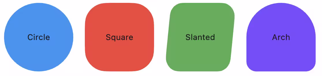
5. Flutter M3 Shapes Extended
A Flutter package for easily using the new Material 3 Expressive Shapes.
Bring a unique and modern feel to your app with a wide variety of predefined shapes. This library provides simple widgets that are easy to customize and integrate into any project.
✨ Features
- Extended Customization: Now supports shadows, borders, gradients, and margins for all shapes.
- Complete Collection: Includes the full suite of Material 3 expressive shapes like Gem, Slanted, Flower, and more.
- Highly Customizable: Easily adjust the size, color, and child of any shape.
- Easy to Use: A simple, declarative API lets you add expressive shapes in seconds.
- Lightweight & Performant: Built with performance in mind using Flutter's
CustomClipper.
Usage:
You can use the shapes as a pure visual element without a child using M3EShape:
Or you can use M3EContainer if you need to wrap a child widget and clip it exactly to the shape.

// Using as a pure shape
M3EShape.circle(
    width: 100,
    height: 100,
    gradient: LinearGradient(
        colors: [Colors.red, Colors.orange],
        begin: Alignment.topLeft,
        end: Alignment.bottomRight,
    ),
    border: BorderSide(color: Colors.black, width: 2),
    boxShadow: [
        BoxShadow(
            color: Colors.black,
            offset: Offset(0, 4),
            blurRadius: 4,
        ),
    ],
    padding: EdgeInsets.all(16),
    margin: EdgeInsets.all(8),
    clipBehavior: Clip.antiAlias,
)

// Using as a container with a child
M3EContainer.gem(
    width: 200,
    height: 200,
    color: Colors.blue,
    child: Center(
       child: Text("Gem Shape"),
    ),
)
Or using the general constructor:
M3EShape(
    Shapes.<your_shape>, // Shapes.slanted
    clipBehavior: clipBehavior,
    height: height,
    width: width,
    color: color,
    gradient: gradient,
    border: border,
    boxShadow: boxShadow,
    padding: padding,
    margin: margin,
);
You can use all the Shapes in this enum:
circle, clampShell, square, slanted, arch, semicircle, oval, pill, triangle, arrow, fan, diamond, pentagon, gem, very_sunny, sunny, c4_sided_cookie, c6_sided_cookie, c7_sided_cookie, c9_sided_cookie, c12_sided_cookie, l4_leaf_clover, l8_leaf_clover, burst, soft_burst, boom, soft_boom, flower, puffy, puffy_diamond, ghostish, pixel_circle, pixel_triangle, bun, hearth
🎯 Check the Example App for more details.
🐞 Found a bug? or ✨ You have a Feature Request?
Feel free to open a Issue or Contribute to the project.
Hope You Love It!
Credits
- Motor Pub Package for Expressive Animations
- Multi_dropdown Pub Package for Dropdown Menu
- flutter_m3shapes Base Package for M3 Shapes Extended
- Claude and Gemini for helping me with the code and documentation.