GradientBlur


A highly performant and customizable Flutter widget that creates a beautiful, soft gradient blur effect — perfect for headers, overlays, cards, and modern UI designs.
Built for Flutter 3.24+, optimized for performance, and easy to integrate.
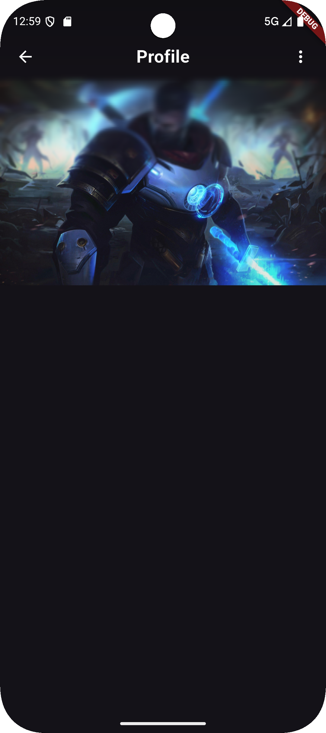
🌟 Preview


✨ Features
✅ Gradient-based blur that blends naturally with your design
✅ Customizable blur intensity and direction
✅ Supports animation and layered effects
✅ GPU-accelerated for smooth performance
✅ Lightweight, easy to use, and flexible
🚀 Installation
Add the dependency to your pubspec.yaml:
dependencies:
  gradient_blur: ^1.0.2+1
Then run:
flutter pub get
🧩 Usage Example
import 'package:flutter/material.dart';
import 'package:gradient_blur/gradient_blur.dart';

class ExamplePage extends StatelessWidget {
  const ExamplePage({super.key});

  @override
  Widget build(BuildContext context) {
    return Scaffold(
      body: Stack(
        children: [
          // Background Image
          Image.network(
            'https://images.unsplash.com/photo-1576085898323-218337e3e43c',
            fit: BoxFit.cover,
            height: double.infinity,
            width: double.infinity,
          ),

          // GradientBlur widget
          Positioned(
            top: 0,
            left: 0,
            right: 0,
            child: GradientBlur(
              maxBlur: 8.0,
              minBlur: 0.0,
              slices: 30,
              curve: Curves.easeInOut,
              edgeBlur: null,
              gradient: LinearGradient(
                colors: [
                  Theme.of(
                    context,
                  ).scaffoldBackgroundColor.withValues(alpha: 0.8),
                  Colors.transparent,
                ],
                begin: Alignment.topCenter,
                end: Alignment.bottomCenter,
                stops: const [0.0, 0.7],
              ),
              child: SafeArea(
                bottom: false,
                child: Container(
                  height: MediaQuery.of(context).size.height / 3,
                  padding: const EdgeInsets.all(16.0),
                  child: Row(
                    children: [
                      IconButton(
                        icon: const Icon(
                          Icons.arrow_back_ios,
                          color: Colors.white,
                        ),
                        onPressed: () => Navigator.of(context).pop(),
                      ),
                      const Text(
                        'Image Example',
                        style: TextStyle(
                          color: Colors.white,
                          fontSize: 20,
                          fontWeight: FontWeight.bold,
                        ),
                      ),
                    ],
                  ),
                ),
              ),
            ),
          ),
        ],
      ),
    );
  }
}
⚙️ Parameters
| Parameter | Type | Description |
|---|---|---|
blur |
double |
The blur intensity (default: 10.0). |
gradient |
Gradient |
The gradient overlay applied on the blur. |
child |
Widget? |
The child widget to display on top of the blur. |
borderRadius |
BorderRadius? |
Optional rounded corners for the blurred area. |
clipBehavior |
Clip |
How the content is clipped (default: Clip.hardEdge). |
💡 Example: Header Overlay
GradientBlur(
  blur: 15,
  gradient: LinearGradient(
    colors: [
      Colors.black.withOpacity(0.6),
      Colors.transparent,
    ],
    begin: Alignment.topCenter,
    end: Alignment.bottomCenter,
  ),
  child: Padding(
    padding: const EdgeInsets.all(16),
    child: Text(
      'Beautiful Gradient Blur Header',
      style: TextStyle(color: Colors.white, fontSize: 20),
    ),
  ),
);
🧠 How It Works
The GradientBlur widget combines BackdropFilter and ShaderMask logic under the hood.
It first applies a Gaussian blur to the background, then overlays a gradient shader to achieve a soft, aesthetic fade effect.
🧰 Example Project
You can explore the full working demo inside the example/ folder of this repository.
Run it with:
flutter run example/lib/main.dart
🧾 License
This project is licensed under the MIT License.
See the LICENSE file for details.
👨💻 Author
Mohamed Waleed Elsherif
GitHub • Pub.dev