flutter_theme_circle_animation
A circle reveal animation for Flutter theme switching, inspired by Telegram's theme transition. Captures the current screen, toggles your theme, then animates a growing circle to reveal the new theme underneath.
No external dependencies. Works with any state management approach.
Platform support
| Android | iOS |
|---|---|
| ✅ | ✅ |
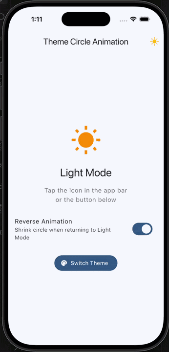
Preview
Installation
Add the package to your pubspec.yaml:
dependencies:
  flutter_theme_circle_animation: ^1.0.1
Then run:
flutter pub get
Usage
1. Wrap your content
Place ThemeCircleAnimation around the widget tree you want the animation to cover. For a full-screen effect, wrap it at the MaterialApp.home level or use MaterialApp.builder:
MaterialApp(
  theme: isDark ? ThemeData.dark() : ThemeData.light(),
  home: ThemeCircleAnimation(
    child: MyHomePage(),
  ),
);
2. Trigger the animation
There are two ways to trigger the theme switch.
With the built-in toggle button:
ThemeCircleSwitch is an IconButton that handles the animation automatically. Drop it into an AppBar or anywhere else in the tree:
ThemeCircleSwitch(
  isDarkMode: isDark,
  onToggle: () => setState(() => isDark = !isDark),
)
Programmatically from any widget:
Use toggleFromWidget to start the animation from a specific widget's position. The circle will expand outward from that widget:
Builder(
  builder: (buttonContext) {
    return ElevatedButton(
      onPressed: () {
        ThemeCircleAnimation.of(buttonContext)?.toggleFromWidget(
          context: buttonContext,
          onToggle: () => setState(() => isDark = !isDark),
        );
      },
      child: Text('Switch Theme'),
    );
  },
)
You can also call toggle directly with a manual origin point, or omit the origin to default to the center of the screen:
ThemeCircleAnimation.of(context)?.toggle(
  onToggle: () => setState(() => isDark = !isDark),
);
How it works
- The widget captures a screenshot of the current screen using
RepaintBoundary. - Your
onTogglecallback runs, switching the theme. - The screenshot is placed on top of the new theme as an overlay.
- A circular clip path animates outward from the tap point, progressively revealing the new theme.
- Once the animation completes, the overlay is removed.
API reference
ThemeCircleAnimation
The wrapper widget that enables the circle reveal animation.
| Parameter | Type | Default | Description |
|---|---|---|---|
child |
Widget |
required | The content to wrap. |
duration |
Duration |
Duration(milliseconds: 500) |
Animation duration. |
curve |
Curve |
Curves.easeInOutCubic |
Animation curve. |
Access the animation state from descendants with ThemeCircleAnimation.of(context).
toggleFromWidget()
Computes the animation origin from a widget's position and starts the reveal.
| Parameter | Type | Default | Description |
|---|---|---|---|
context |
BuildContext |
required | Context of the widget to animate from. |
onToggle |
VoidCallback |
required | Callback to switch your theme state. |
duration |
Duration? |
widget default | Override the animation duration. |
curve |
Curve? |
widget default | Override the animation curve. |
isReverse |
bool |
false |
Reverse the animation (shrink instead of expand). |
toggle()
Starts the reveal animation with a manual origin point.
| Parameter | Type | Default | Description |
|---|---|---|---|
onToggle |
VoidCallback |
required | Callback to switch your theme state. |
origin |
Offset? |
screen center | Position the circle expands from. |
duration |
Duration? |
widget default | Override the animation duration. |
curve |
Curve? |
widget default | Override the animation curve. |
isReverse |
bool |
false |
Reverse the animation (shrink instead of expand). |
originFromContext() (static)
Returns the center of a widget in global coordinates. Useful for computing a custom origin:
final origin = ThemeCircleAnimationState.originFromContext(context);
ThemeCircleSwitch
A ready-made IconButton with an animated sun/moon icon.
| Parameter | Type | Default | Description |
|---|---|---|---|
isDarkMode |
bool |
required | Current theme state. |
onToggle |
VoidCallback |
required | Callback to switch theme. |
darkModeIcon |
Widget? |
moon icon | Custom icon for dark mode. |
lightModeIcon |
Widget? |
sun icon | Custom icon for light mode. |
iconTransitionDuration |
Duration |
Duration(milliseconds: 300) |
Icon crossfade duration. |
iconSize |
double? |
default | Icon size. |
tooltip |
String? |
'Toggle theme' |
Tooltip text. |
enableReverseAnimation |
bool |
true |
When returning to light mode, play reverse animation. |
Tips
Wrap at the highest level you can. If you want the animation to cover the entire screen including the AppBar, use MaterialApp.builder:
MaterialApp(
  builder: (context, child) => ThemeCircleAnimation(child: child!),
  home: MyHomePage(),
);
Example
A full working example is available in the example directory.
License
MIT. See LICENSE for details.
Libraries
- flutter_theme_circle_animation
- A Flutter package that provides a beautiful circle reveal animation for theme switching, similar to Telegram's theme transition effect.