flutter_nav_toggle
A dual-mode navigation widget for Flutter that smoothly morphs between sidebar, icon rail, and tab bar layouts with clip-path animations.
Installation
Add flutter_nav_toggle to your pubspec.yaml:
dependencies:
  flutter_nav_toggle: ^1.2.0
Then run:
flutter pub get
Features
- Three navigation modes — sidebar, icon rail, and tab bar with smooth animated transitions
- Morphing toggle button — cursor-tracking directional arrows with branding support (logo + label), powered by
morphing_button - Badge support — per-item badge counts with automatic aggregation on parent items
- Header branding —
NavHeaderwith logo, title, and subtitle merged into the toggle button - Page transitions —
.withPages()constructor with fade, slide, and fadeThrough transitions viaAnimatedSwitcher - Keyboard shortcuts — press
Tto toggle navigation mode - Hierarchical items — expand/collapse in sidebar, overlay dropdowns in tab bar
- Status panel — CPU/MEM/DISK progress bars with color-coded thresholds, tappable warning count, optional time and userName display,
copyWithfor partial updates - User info — avatar panel with optional
onTapcallback, hover feedback, and flyout menu support - Auto-responsive — opt-in breakpoint system that auto-switches between sidebar/icon rail/tab bar based on screen width
- Overlay sidebar — on narrow screens with auto-responsive enabled, toggle shows sidebar as a floating overlay with scrim dismiss
- Per-item icon color —
iconColoronNavItemfor custom icon tinting - Route restoration —
initialSelectedIdto restore the last selected page on startup - Initial mode —
initialModeto start in sidebar, icon rail, or tab bar - 4 built-in themes — Light, Dark, Ocean, Sunset (or build your own with
NavToggleTheme.copyWith) - Fully configurable — dimensions, durations, easing curves, colors, fonts, border radii
- Accessibility — respects
MediaQuery.disableAnimations
Quick Start
import 'package:flutter_nav_toggle/flutter_nav_toggle.dart';

NavToggleScaffold(
  items: [
    NavItem(id: 'home', label: 'Home', icon: Icons.home_outlined),
    NavItem(id: 'settings', label: 'Settings', icon: Icons.settings_outlined, badge: 3),
  ],
  header: NavHeader(
    logo: Icon(Icons.dashboard, size: 24),
    title: 'My App',
  ),
  onItemSelected: (id) => print('Selected: $id'),
  child: Center(child: Text('Content')),
)
Hierarchical Items
NavItem(
  id: 'products',
  label: 'Products',
  icon: Icons.inventory_outlined,
  children: [
    NavItem(id: 'electronics', label: 'Electronics', icon: Icons.devices_outlined),
    NavItem(id: 'clothing', label: 'Clothing', icon: Icons.checkroom_outlined),
  ],
)
Parents expand/collapse in sidebar mode and open overlay dropdowns in tab bar mode.
Route Restoration
Use initialSelectedId to restore the user's last page on startup. Works with both constructors:
NavToggleScaffold.withPages(
  items: items,
  pages: pages,
  initialSelectedId: 'settings', // starts on Settings instead of the first item
  initialMode: NavMode.iconRail, // start in icon rail mode (default: sidebar)
)
Combine with your own persistence (SharedPreferences, Hive, etc.) to save and restore the selected page across sessions.
Page Transitions
Use .withPages() to let the scaffold manage content switching with animated transitions:
NavToggleScaffold.withPages(
  items: items,
  pages: {
    'home': HomePage(),
    'settings': SettingsPage(),
  },
  pageTransitionType: PageTransitionType.fadeThrough,
  showPageHeader: true,
  enableKeyboardShortcuts: true,
)
Available transition types: fade, slideHorizontal, fadeThrough.
Theming
// Use a built-in preset
NavToggleScaffold(
  theme: const NavToggleTheme.ocean(),
  // ...
)

// Or customize
NavToggleScaffold(
  theme: const NavToggleTheme.dark().copyWith(
    sidebarWidth: 260,
    accent: Color(0xFFFF6B6B),
    collapseDuration: Duration(milliseconds: 300),
  ),
  // ...
)
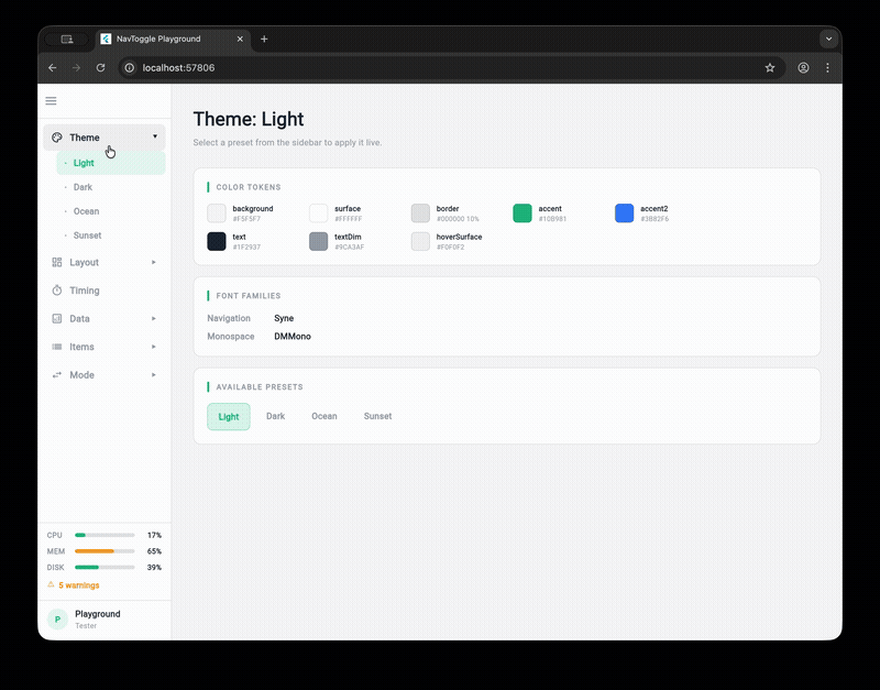
Available presets: NavToggleTheme() (light), .dark(), .ocean(), .sunset()
System Status & User Info
NavToggleScaffold(
  systemStatus: SystemStatus(
    cpu: 0.42,        // 0.0–1.0, color-coded: green <60%, amber 60-80%, red >=80%
    memory: 0.67,
    disk: 0.55,
    warnings: 3,      // warning count displayed in status panel
    time: '14:32:05', // optional time string
    userName: 'admin', // optional user name in status panel
    onWarningTap: () => print('Navigate to alerts'), // makes warning row tappable
  ),
  userInfo: UserInfo(name: 'Alice', role: 'Admin', onTap: () => print('User tapped')),
  // ...
)
Status displays as progress bars (sidebar) or compact chips (tab bar). User info shows as an avatar panel (sidebar) or chip (tab bar).
SystemStatus supports copyWith() for efficient partial updates:
final status = SystemStatus(cpu: 0.5, memory: 0.7, disk: 0.3);
final updated = status.copyWith(cpu: 0.8); // only changes CPU
For high-frequency updates (e.g., real-time CPU monitoring), use NavToggleController.updateStatusSilent() to avoid excessive rebuilds:
controller.updateStatusSilent(newStatus); // no rebuild
// ... later, when ready to repaint:
controller.updateStatus(newStatus); // triggers rebuild
User Flyout Menu
Provide menuItems on UserInfo to show a flyout popup when the avatar is tapped, instead of firing onTap directly:
userInfo: UserInfo(
  name: 'Alice',
  role: 'Admin',
  menuItems: [
    UserMenuItem(label: 'View Profile', icon: Icons.person_outline, onTap: () {}),
    UserMenuItem(label: 'Sign Out', icon: Icons.logout, onTap: () {}),
  ],
),
The flyout pops right in sidebar/icon rail mode and drops down in tab bar mode. When menuItems is null or empty, the widget falls back to the onTap callback.
Per-Item Icon Color
Use iconColor on NavItem for custom icon tinting (e.g., brand-colored icons). Selection is indicated by background highlight instead of icon color change:
NavItem(
  id: 'alerts',
  label: 'Alerts',
  icon: Icons.warning_amber_outlined,
  iconColor: Color(0xFFEF4444), // always red, regardless of selection state
)
Auto-Responsive Mode
Enable autoResponsive on the theme to auto-switch navigation mode based on screen width:
NavToggleScaffold(
  theme: const NavToggleTheme().copyWith(
    autoResponsive: true,
    breakpointSidebar: 1024, // >= 1024px → sidebar (default)
    breakpointRail: 768,     // >= 768px  → icon rail (default)
                             // < 768px   → tab bar
  ),
  // ...
)
When autoResponsive is false (default), mode only changes via the toggle button — existing behavior unchanged.
Overlay Sidebar
With auto-responsive enabled, pressing the toggle button on a narrow screen (below breakpointSidebar) shows the sidebar as a floating overlay instead of pushing content:
- Semi-transparent scrim darkens the background
- Tap the scrim or select a nav item to dismiss
- Keyboard shortcut
Talso toggles the overlay - Content stays full-width underneath
This follows the Material Design drawer pattern for tablet/mobile users who want full navigation access without losing their current view.
Run the Playground
cd example
flutter run -d chrome
The example app is an interactive playground that lets you tweak every property live.
Libraries
- A dual-mode navigation toggle widget that morphs between sidebar and tab bar layouts.