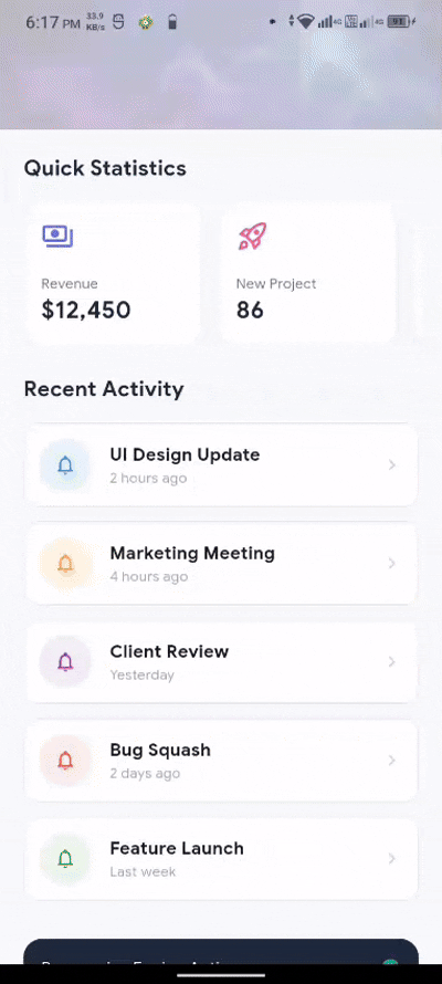
🎬 Demo
FlutterAdaptiveScaler

A Flutter package for fully responsive apps. Automatically scales fonts, sizes, padding, icons, radius, lists, grids, and all UI elements for every screen, device, orientation, and web/desktop window resize.
Features
- 🚀 Instant Scaling: Scales everything based on your design reference size.
- 📱 Universal Support: Works seamlessly on Mobile, Tablet, iPad, Web, and Desktop.
- 🔄 Real-time Updates: Automatically recalculates on orientation changes and window resizing.
- 🧩 Simple Extensions: Use
.w,.h,.sp,.r,.i, and.pon any number. - ⚡ Proactive Rebuilding:
FlutterScalerwrapper withbuilderpattern for full reactivity.
Getting Started
Add flutter_scaler to your pubspec.yaml:
dependencies:
  flutter_scaler: ^0.0.1
Usage
Wrap your MaterialApp with FlutterScaler. Using the builder pattern is recommended to ensure that everything updates correctly when the screen size changes:
import 'package:flutter_scaler/flutter_scaler.dart';

void main() {
  runApp(const MyApp());
}

class MyApp extends StatelessWidget {
  @override
  Widget build(BuildContext context) {
    return FlutterScaler(
      baseWidth: 375, // Your design width (default: 375)
      baseHeight: 812, // Your design height (default: 812)
      builder: (context, child) => MaterialApp(
        title: 'My Scaled App',
        home: MyHomePage(),
      ),
    );
  }
}
Responsive Extensions
Apply scaling to any number by simply adding an extension:
200.w: Scale width100.h: Scale height16.sp: Scale font size8.r: Scale border radius24.i: Scale icon size12.p: Scale padding/margin
Container(
  width: 200.w,
  height: 100.h,
  padding: EdgeInsets.all(12.p),
  decoration: BoxDecoration(
    borderRadius: BorderRadius.circular(8.r),
    color: Colors.blue,
  ),
  child: Column(
    children: [
      Icon(Icons.star, size: 24.i),
      Text('Hello Responsive!', style: TextStyle(fontSize: 16.sp)),
    ],
  ),
)
Scaling Logic
The package calculates scale factors dynamically:
scaleWidth = currentWidth / baseWidthscaleHeight = currentHeight / baseHeightscaleText = min(scaleWidth, scaleHeight)
The min logic ensures that your text and icons never overflow even if the screen's aspect ratio differs dramatically from your design reference.
Example
Check out the full professional dashboard example in the example folder.
Author
Created by GreeLogix.
Libraries
- flutter_adaptive_scaler
- A powerful Flutter package for building fully responsive applications.