Flexify
Flexify is a Flutter package that makes it easy to adapt your applications to different screen sizes. Simple to use, it offers developers the ability to automatically adjust their interfaces according to device dimensions. With this package, your app looks great on everything from small phones to large tablets.
Features
- Automatically adjust UI elements based on screen size.
- Responive font size resolution.
- Easy integration with existing Flutter applications.
Installation
Add the following line to your pubspec.yaml file:
dependencies:
  flexify: ^1.0.5
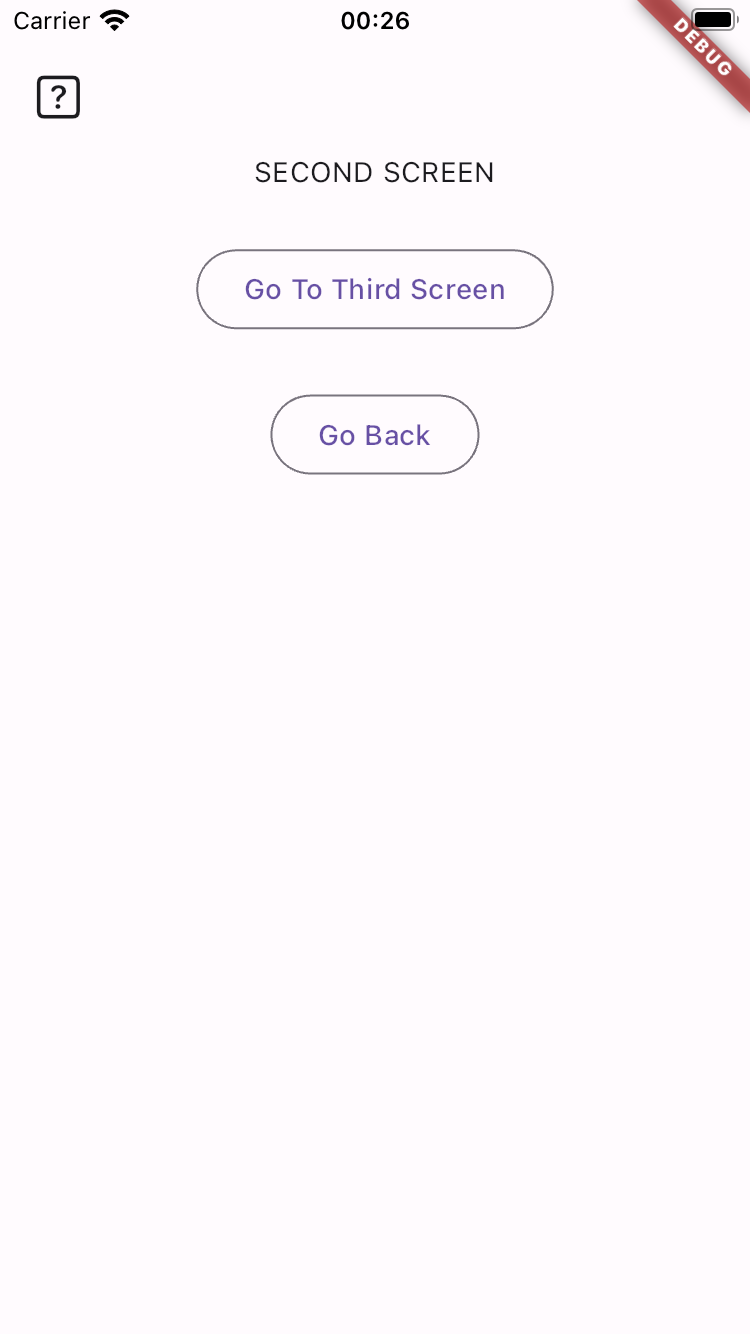
Screenshot
Usage
import 'package:flutter/material.dart';
import 'package:flexify/flexify.dart';

void main() {
  runApp(
    //Wrap your app with Flexify for initialize
    const Flexify(
      designWidth: 375,
      designHeight: 812,
      app: MyApp(),
    ),
  );
}

class MyApp extends StatelessWidget {
  const MyApp({super.key});

  @override
  Widget build(BuildContext context) {
    return MaterialApp(
      home: Scaffold(
        appBar: AppBar(title: const Text('Flexify Example')),
        body: const ExampleScreen(),
      ),
    );
  }
}

class ExampleScreen extends StatelessWidget {
  const ExampleScreen({super.key});

  @override
  Widget build(BuildContext context) {
    return Center(
      child: Column(
        mainAxisAlignment: MainAxisAlignment.center,
        children: [
          // Example using .rt for responsive text size
          Text(
            'This is a Responsive Text',
            style: TextStyle(
              fontSize: 20.rt,
              fontWeight: FontWeight.w700,
            ),
          ),
          SizedBox(height: 20.0.rh), // Example using .rh for responsive height

          // Example using .rw & .rh for responsive width & height
          Container(
            width: 200.rw,
            height: 200.rh,
            color: Colors.blue,
            child: Center(
              child: Text(
                'Box with responsive width and height',
                textAlign: TextAlign.center,
                style: TextStyle(
                  fontSize: 20.rt,
                  fontWeight: FontWeight.w700,
                ),
              ),
            ),
          ),
          SizedBox(height: 20.0.rh),

          // Example using .rs for responsive size
          Container(
            width: 200.rs,
            height: 200.rs,
            color: Colors.red,
            child: Center(
              child: Text(
                'Box with responsive size',
                textAlign: TextAlign.center,
                style: TextStyle(
                  fontSize: 20.rt,
                  fontWeight: FontWeight.w700,
                ),
              ),
            ),
          ),
        ],
      ),
    );
  }
}