DropdownProPlus
A customizable dropdown package for Flutter.
Features
- Customizable dropdown overlay
- Searchable dropdown
- Multi-select support
- Clean and simple API
- Easy integration into any Flutter app
Installation
Add this to your pubspec.yaml:
dependencies:
dropdownproplus: ^0.1.2
Then run:
bash
Copy code
flutter pub get
Usage
dart
Copy code
import 'package:flutter/material.dart';
import 'package:dropdownproplus/dropdownproplus.dart';
void main() {
runApp(const ExampleApp());
}
class ExampleApp extends StatelessWidget {
const ExampleApp({super.key});
@override
Widget build(BuildContext context) {
return MaterialApp(
title: 'DropdownProPlus Example',
debugShowCheckedModeBanner: false,
theme: ThemeData(primarySwatch: Colors.blue),
home: const ExamplePage(),
);
}
}
class ExamplePage extends StatelessWidget {
const ExamplePage({super.key});
@override
Widget build(BuildContext context) {
return Scaffold(
appBar: AppBar(title: const Text("DropdownProPlus Example")),
body: Padding(
padding: const EdgeInsets.all(30.0),
child: Column(
children: [
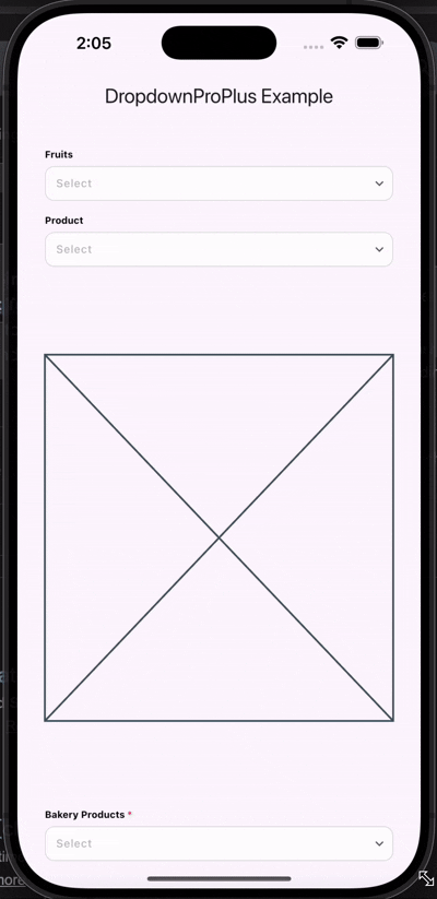
DropdownPlus(
isEnabled: true,
enableSearchBar: true,
dropdownLabel: "Fruits",
onItemSelected: (value) {},
dropdownItems: ["Apple", "Banana", "Orange", "Mango"],
value: '',
callBackKey: '',
),
SizedBox(height: 15),
DropdownPlus(
isEnabled: true,
enableSearchBar: true,
enableMultiSelect: true,
dropdownLabel: "Product",
onItemSelected: (value) {
ScaffoldMessenger.of(context).showSnackBar(
SnackBar(content: Text("Selected: $value")),
);
},
dropdownItems: [
"Product1", "Product2", "Product3", "Product4",
"Product5", "Product6", "Product7", "Product8", "Product9"
],
value: '',
callBackKey: '',
),
Spacer(),
Placeholder(),
Spacer(),
DropdownPlus(
isEnabled: true,
enableSearchBar: true,
isMandatory: true,
dropdownLabel: "Bakery Products",
onItemSelected: (value) {
ScaffoldMessenger.of(context).showSnackBar(
SnackBar(content: Text("Selected: $value")),
);
},
dropdownItems: [
"Bread", "Butter", "Toast", "Khari",
"Milk", "Cheese", "Curd", "Butter Milk", "Cookies"
],
value: '',
callBackKey: '',
),
SizedBox(height: 30),
],
),
),
);
}
}
## Parameters
Parameter Description
dropdownLabel Label displayed for the dropdown
dropdownItems List of dropdown items
onItemSelected Callback when an item is selected
isEnabled Enable or disable the dropdown
enableSearchBar Enable search bar inside dropdown
enableMultiSelect Enable multi-selection
isMandatory Marks field as required
value Selected value for customized items or JSON/POJO objects
callBackKey Access tapped details of dropdown item