A highly customizable and beautifully animated CustomQuickAlert dialog package for Flutter. Create stunning, professional-looking alerts for any situation with minimal code.


✨ Features
| Feature | Description |
|---|---|
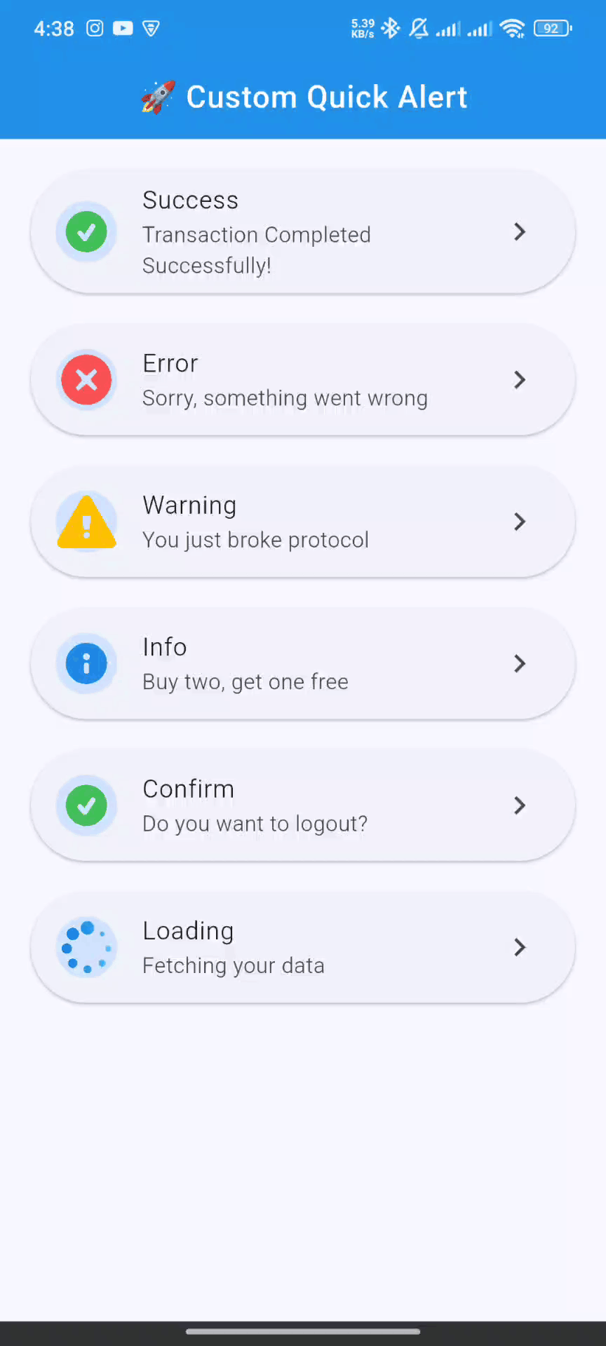
| 🎨 Versatile Alert Types | Includes pre-built styles for success, error, warning, info, confirm, and loading. |
| 🎬 Engaging Animations | Each alert type is enhanced with a smooth, high-quality Lottie animation for a polished user experience. |
| 🔧 Deeply Customizable | Tailor every detail—colors, text styles, buttons, and more. You can even embed your own custom widgets. |
| 🚀 Developer-Friendly API | A clean and intuitive API lets you trigger beautiful alerts with just a single line of code. |
| 🌐 Context-Free Triggering | Display alerts from your business logic (ViewModels, BLoCs, etc.) without needing to pass context. |
| ⏱️ Auto-Dismiss Timer | Configure alerts to automatically close after a specified duration. |
| 🌟 Entrance Animations | Choose how your alert appears on screen, with options like scale, slideIn, and rotate. |
| 📱 Responsive by Design | Looks great on any screen size and supports custom widget content for ultimate flexibility. |
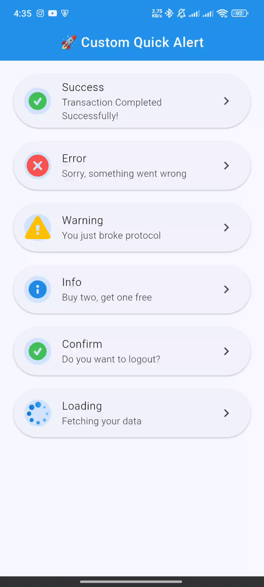
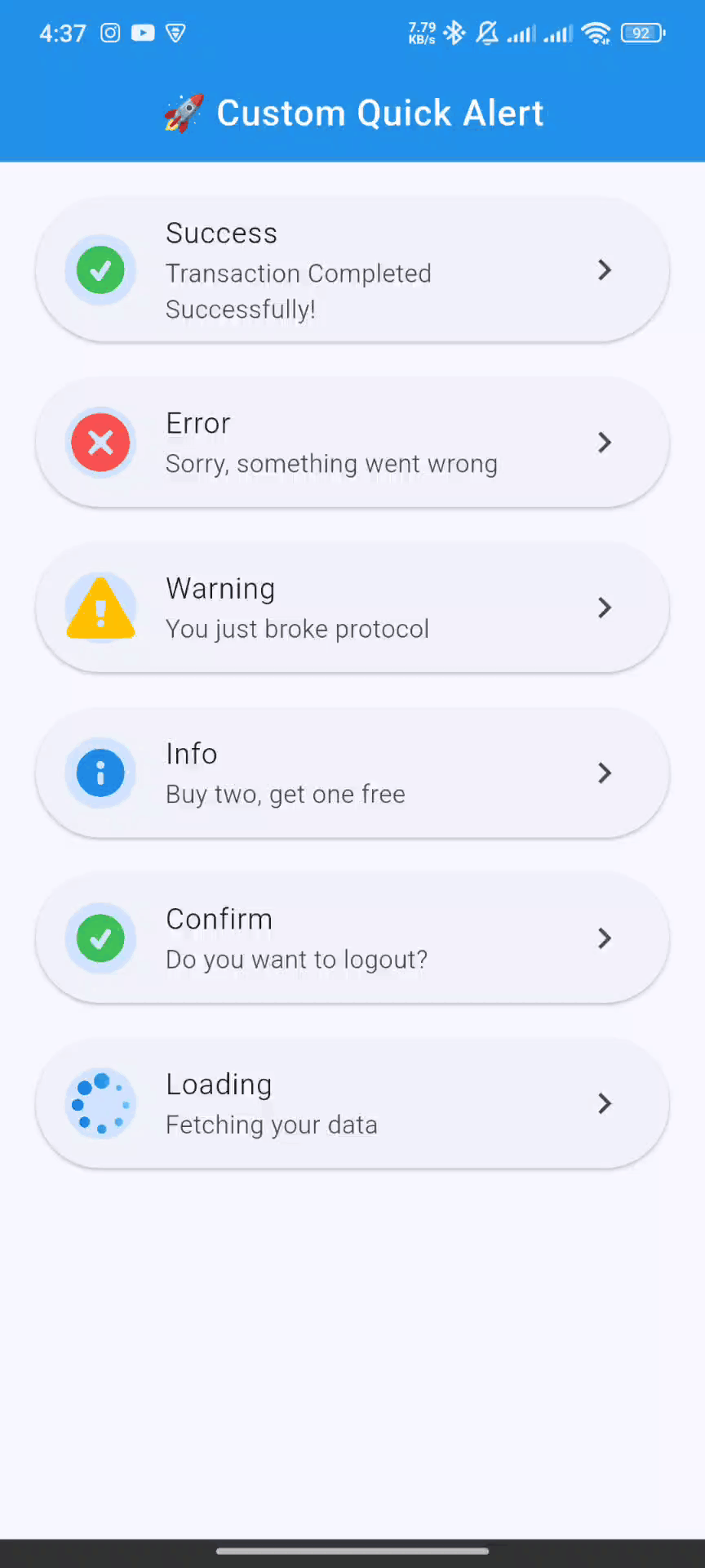
📸 Screenshots
| Success | Error | Warning |
|---|---|---|
 |
 |
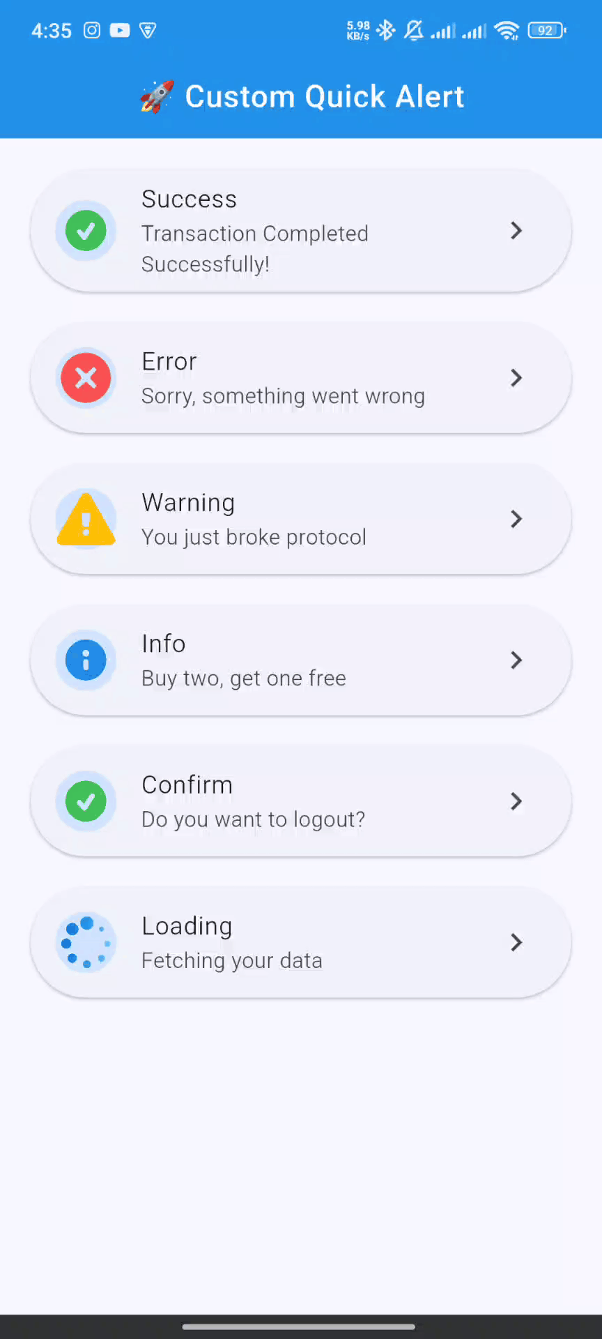 |
| Info | Confirm | Loading |
|---|---|---|
 |
 |
 |
🚀 Getting Started
Follow these steps to get custom_quick_alert up and running in your project.
1. Installation
Add custom_quick_alert to your project's dependencies by running this command in your terminal:
flutter pub add custom_quick_alert
This will add the latest version to your pubspec.yaml file and run flutter pub get automatically.
2. Import
Import the package where you intend to use it:
import 'package:custom_quick_alert/custom_quick_alert.dart';
3. Crucial Setup for MaterialApp
To enable showing alerts from anywhere in your app (without passing context), you must assign the customQuickAlertNavigatorKey to the navigatorKey property of your MaterialApp or CupelationApp.
import 'package:flutter/material.dart';
import 'package:custom_quick_alert/custom_quick_alert.dart';

void main() {
  runApp(const MyApp());
}

class MyApp extends StatelessWidget {
  const MyApp({super.key});

  @override
  Widget build(BuildContext context) {
    return MaterialApp(
      title: 'Custom Quick Alert Demo',
      // THIS IS THE CRUCIAL PART
      navigatorKey: customQuickAlertNavigatorKey,
      home: const HomePage(),
    );
  }
}
💡 Basic Usage
Calling an alert is incredibly simple. Here are examples for each built-in type.
✅ Success Alert
CustomQuickAlert.success(
  title: 'Success!',
  message: 'Your profile has been updated.',
);
❌ Error Alert
CustomQuickAlert.error(
  title: 'Oops!',
  message: 'Failed to connect to the server.',
);
⚠️ Warning Alert
CustomQuickAlert.warning(
  title: 'Are you sure?',
  message: 'This will permanently delete your account.',
);
ℹ️ Info Alert
CustomQuickAlert.info(
  title: 'Did you know?',
  message: 'You can customize almost everything in this alert.',
);
🤔 Confirm Alert
Use this to get user confirmation. The onConfirm and onCancel callbacks handle the user's choice.
CustomQuickAlert.confirm(
  title: 'Save Changes?',
  message: 'Any unsaved progress will be lost.',
  confirmText: 'Save',
  cancelText: 'Discard',
  onConfirm: () {
    print('Confirmed! Saving data...');
    // You can call CustomQuickAlert.dismiss() here if you want to close the dialog manually
  },
  onCancel: () {
    print('Cancelled! Discarding changes.');
  },
);
⏳ Loading Alert
Show a loading indicator during an async operation. Remember to dismiss it manually!
void processPayment() async {
  // Show loading alert
  CustomQuickAlert.loading();

  // Simulate a network request
  await Future.delayed(const Duration(seconds: 3));

  // Dismiss the loading alert
  CustomQuickAlert.dismiss();

  // Show success alert
  CustomQuickAlert.success(title: 'Payment Complete!');
}
🛠️ Advanced Customization
Unleash the full power of custom_quick_alert by using the CustomQuickAlert.show() method. This gives you fine-grained control over every element.
Customization Parameters
| Parameter | Type | Description |
|---|---|---|
type |
CustomQuickAlertType |
Required. The type of alert (success, error, custom, etc.). |
title |
String? |
The main title of the alert. |
message |
String? |
The body text of the alert. |
lottieAsset |
String? |
Path to a custom Lottie JSON file from your assets. |
customContent |
Widget? |
A custom widget to display below the message for extra content. |
animType |
CustomQuickAlertAnimType |
The entrance animation (scale, slideInDown, etc.). |
position |
CustomQuickAlertPosition |
The position on the screen (center, top, bottom). |
barrierDismissible |
bool |
If true, tapping the overlay dismisses the alert. Defaults to true. |
showCancel |
bool |
Toggles the visibility of the cancel button. |
showConfirm |
bool |
Toggles the visibility of the confirm button. |
confirmText |
String |
Custom text for the confirm button. |
cancelText |
String |
Custom text for the cancel button. |
onConfirm |
VoidCallback? |
Action to perform when the confirm button is tapped. |
onCancel |
VoidCallback? |
Action to perform when the cancel button is tapped. |
confirmBtnColor |
Color |
Background color of the confirm button. |
cancelBtnColor |
Color |
Outline and text color of the cancel button. |
confirmTextColor |
Color |
Text color for the confirm button. |
cancelTextColor |
Color |
Text color for the cancel button. |
backgroundColor |
Color |
Background color of the entire alert dialog. |
titleColor |
Color |
Color of the title text. |
messageColor |
Color |
Color of the message text. |
autoCloseDuration |
Duration? |
If set, the dialog automatically closes after this duration. |
borderRadius |
double |
The corner radius of the dialog card. |
width |
double? |
Manually set a custom width for the dialog. |
disableBackBtn |
bool |
If true, the Android back button will not dismiss the dialog. |
Full Customization Example
Here's an example of a completely custom alert:
CustomQuickAlert.show(
  type: CustomQuickAlertType.custom,
  // Use your own Lottie animation
  lottieAsset: 'assets/custom_animation.json',
  title: 'Rate Your Experience!',
  message: 'How would you rate our service today?',
  // Add a custom widget
  customContent: const Row(
    mainAxisAlignment: MainAxisAlignment.center,
    children: [
      Icon(Icons.star, color: Colors.amber),
      Icon(Icons.star, color: Colors.amber),
      Icon(Icons.star, color: Colors.amber),
      Icon(Icons.star, color: Colors.amber),
      Icon(Icons.star_border, color: Colors.grey),
    ],
  ),
  // Customize buttons and colors
  confirmText: 'Submit',
  cancelText: 'Later',
  showCancel: true,
  onConfirm: () => print('Rating submitted!'),
  onCancel: () => print('Rating skipped.'),
  confirmBtnColor: Colors.green,
  backgroundColor: const Color(0xFF222831),
  titleColor: Colors.white,
  messageColor: Colors.white70,
  // Other properties
  animType: CustomQuickAlertAnimType.slideInLeft,
  position: CustomQuickAlertPosition.bottom,
  borderRadius: 20.0,
  disableBackBtn: true,
);
🕹️ API Reference
CustomQuickAlertAnimType
Choose the entrance animation for the alert.
scale(default)rotateslideInDownslideInUpslideInLeftslideInRight
CustomQuickAlertPosition
Set the position of the alert on the screen.
center(default)topbottom
CustomQuickAlert.dismiss()
A static method to programmatically dismiss the currently visible alert.
// Dismisses any active alert
CustomQuickAlert.dismiss();
🤝 Contributing
Contributions are what make the open-source community such an amazing place to learn, inspire, and create. Any contributions you make are greatly appreciated.
- Fork the Project
- Create your Feature Branch (
git checkout -b feature/AmazingFeature) - Commit your Changes (
git commit -m 'Add some AmazingFeature') - Push to the Branch (
git push origin feature/AmazingFeature) - Open a Pull Request
📄 License
Distributed under the MIT License. See LICENSE for more information.
Made with ❤️ by Your Name *