ComposableDataTable
A highly customizable, composable data table widget for Flutter. Built with a modular architecture — use the full table or pick individual components like filters, pagination, badges, and selection bars.
Features
- DataTablePlus — Generic typed data table with flex-based columns, row selection, action columns, and column info/description row
- TableFilterToolbar — Two-row filter toolbar with main filters, advanced collapsible filters, search, dropdowns, date range pickers, and date presets
- TablePagination — Pagination controls with page size dropdown, page number buttons, and customizable text templates
- TableSelectionBar — Animated selection action bar with select all / clear selection controls
- TableContextualBar — Toolbar that swaps between a custom normal toolbar and a contextual action bar on selection, with zero-shift opacity animation
- StatusBadge — Pill-shaped badge with 5 semantic factories (success, warning, danger, info, neutral)
- CountBadge — Small numeric badge for counts and notifications
- DataTablePlusTheme — Full theming system via
InheritedWidget, withcopyWithsupport and 20+ customizable properties
Installation
Add to your pubspec.yaml:
dependencies:
  composable_data_table: ^0.1.0
Then run:
flutter pub get
Quick Start
import 'package:composable_data_table/composable_data_table.dart';
Basic Table
DataTablePlus<User>(
  items: users,
  idGetter: (user) => user.id,
  columns: [
    ColumnDefinition<User>(
      label: 'Name',
      flex: 2,
      cellBuilder: (user) => Text(user.name),
    ),
    ColumnDefinition<User>(
      label: 'Email',
      flex: 2,
      cellBuilder: TextCellBuilder.text<User>(
        (user) => user.email,
      ),
    ),
    ColumnDefinition<User>(
      label: 'ID',
      cellBuilder: TextCellBuilder.monospace<User>(
        (user) => user.id,
      ),
    ),
  ],
)
Row Selection
DataTablePlus<User>(
  items: users,
  idGetter: (user) => user.id,
  columns: columns,
  showCheckboxes: true,
  selectedIds: _selectedIds,
  allSelected: _selectedIds.length == users.length,
  onSelectionChanged: (id) {
    setState(() {
      _selectedIds.contains(id)
          ? _selectedIds.remove(id)
          : _selectedIds.add(id);
    });
  },
  onSelectAllChanged: () {
    setState(() {
      if (_selectedIds.length == users.length) {
        _selectedIds.clear();
      } else {
        _selectedIds = users.map((u) => u.id).toSet();
      }
    });
  },
)
Action Column
DataTablePlus<User>(
  items: users,
  idGetter: (user) => user.id,
  columns: columns,
  actionBuilder: (user) => Row(
    children: [
      IconButton(
        icon: const Icon(Icons.edit, size: 16),
        onPressed: () => editUser(user),
      ),
      IconButton(
        icon: const Icon(Icons.delete, size: 16),
        onPressed: () => deleteUser(user),
      ),
    ],
  ),
  actionLabel: 'Actions',
  actionFlex: 1,
)
Column Descriptions
ColumnDefinition<User>(
  label: 'Score',
  description: 'Performance score from 0 to 100',
  cellBuilder: (user) => Text(user.score.toString()),
)

// In the table, toggle column info visibility:
DataTablePlus<User>(
  // ...
  showColumnInfo: _showInfo,
  onToggleColumnInfo: () => setState(() => _showInfo = !_showInfo),
)
Pagination
TablePagination(
  currentPage: _currentPage,
  totalPages: (_totalItems / _pageSize).ceil(),
  totalItems: _totalItems,
  pageSize: _pageSize,
  pageSizeOptions: [10, 20, 50, 100],
  onPageChanged: (page) => setState(() => _currentPage = page),
  onPageSizeChanged: (size) => setState(() {
    _pageSize = size;
    _currentPage = 1;
  }),
  itemRangeTemplate: 'Showing {start}-{end} of {total}',
  pageSizeTemplate: '{size}/page',
)
Filter Toolbar
TableFilterToolbar(
  mainFilters: [
    FilterSearchField(
      onChanged: (value) => setState(() => _search = value),
      hint: 'Search users...',
    ),
    FilterDropdown<String>(
      value: _selectedRole,
      hint: 'All Roles',
      items: roles.map((r) => DropdownMenuItem(
        value: r,
        child: Text(r),
      )).toList(),
      onChanged: (value) => setState(() => _selectedRole = value),
    ),
    FilterDateRangePicker(
      label: 'Created',
      fromDate: _fromDate,
      toDate: _toDate,
      onFromDateChanged: (d) => setState(() => _fromDate = d),
      onToDateChanged: (d) => setState(() => _toDate = d),
    ),
  ],
  trailingActions: [
    FilterResetButton(onReset: _resetFilters),
  ],
  fixedEndAction: FilterAdvancedToggle(
    isExpanded: _showAdvanced,
    onToggle: () => setState(() => _showAdvanced = !_showAdvanced),
    activeFilterCount: _activeAdvancedCount,
  ),
  advancedFilters: [
    FilterDatePresets(
      onPresetSelected: (from, to) => setState(() {
        _fromDate = from;
        _toDate = to;
      }),
    ),
  ],
  showAdvancedFilters: _showAdvanced,
)
Selection Bar
TableSelectionBar(
  selectedCount: _selectedIds.length,
  pageItemCount: currentPageItems.length,
  allPageSelected: _allPageSelected,
  onSelectAllPage: _toggleSelectAllPage,
  onClearSelection: () => setState(() => _selectedIds.clear()),
  selectedCountTemplate: '{count} selected',
)
Contextual Action Bar
TableContextualBar(
  selectedCount: _selectedIds.length,

  // State 1: your custom toolbar (shown when nothing selected)
  normalToolbar: Row(
    children: [
      FilledButton.icon(
        onPressed: _addItem,
        icon: const Icon(Icons.add),
        label: const Text('Add User'),
      ),
      const Spacer(),
      SearchField(onChanged: _onSearch),
    ],
  ),

  // State 2: contextual bar (shown when selectedCount > 0)
  selectedCountTemplate: '{count} selected',
  selectAllWidget: OutlinedButton(
    onPressed: _toggleSelectAll,
    child: Text('Select All (${items.length})'),
  ),
  actions: [
    OutlinedButton.icon(
      onPressed: _clearSelection,
      icon: const Icon(Icons.close),
      label: const Text('Cancel'),
    ),
    FilledButton.icon(
      onPressed: _deleteSelected,
      icon: const Icon(Icons.delete),
      label: Text('Delete (${_selectedIds.length})'),
    ),
  ],
)
Status Badges
// Semantic factories
StatusBadge.success('Active')
StatusBadge.warning('Pending')
StatusBadge.danger('Blocked')
StatusBadge.info('New')
StatusBadge.neutral('Draft')

// Custom colors
StatusBadge(
  label: 'Custom',
  backgroundColor: Colors.purple.shade50,
  textColor: Colors.purple,
)

// Count badge
CountBadge(count: 42)
Theming
Wrap your widget tree with DataTablePlusThemeProvider to customize the look of all components:
DataTablePlusThemeProvider(
  theme: DataTablePlusTheme(
    accentColor: Colors.indigo,
    backgroundColor: Colors.white,
    headerBackgroundColor: Colors.grey.shade100,
    borderColor: Colors.grey.shade300,
    textPrimaryColor: Colors.grey.shade900,
    textSecondaryColor: Colors.grey.shade600,
    successColor: Colors.green,
    warningColor: Colors.orange,
    dangerColor: Colors.red,
    borderRadius: 12.0,
    headerPadding: EdgeInsets.symmetric(horizontal: 16, vertical: 12),
    cellPadding: EdgeInsets.symmetric(horizontal: 16, vertical: 14),
  ),
  child: YourTableWidget(),
)
Use copyWith to modify the default theme:
DataTablePlusTheme.defaultTheme.copyWith(
  accentColor: Colors.teal,
  borderRadius: 8.0,
)
Widgets Reference
| Widget | Description |
|---|---|
DataTablePlus<T> |
Core data table with selection, actions, column info |
ColumnDefinition<T> |
Column config — label, flex, cellBuilder, headerBuilder, description |
TextCellBuilder |
Predefined cell builders: .text(), .monospace() |
TablePagination |
Page controls with size selector and range display |
TableSelectionBar |
Animated selection bar with select all / clear |
TableContextualBar |
Toolbar ↔ contextual action bar swap on selection |
TableFilterToolbar |
Two-row filter layout with advanced collapse |
FilterSearchField |
Styled search input |
FilterDropdown<T> |
Styled dropdown selector |
FilterDateRangePicker |
From/to date picker with clear button |
FilterDatePresets |
Quick date range preset buttons (Today, Last 7 days, etc.) |
FilterAdvancedToggle |
Toggle button for advanced filters with badge count |
FilterResetButton |
Icon-only reset button with spin animation |
FilterClearButton |
Text clear button for advanced filter row |
StatusBadge |
Pill badge with 5 factories: success, warning, danger, info, neutral |
CountBadge |
Small numeric badge |
DataTablePlusTheme |
Theme data with 20+ properties and copyWith |
DataTablePlusThemeProvider |
InheritedWidget to provide theme down the tree |
Example
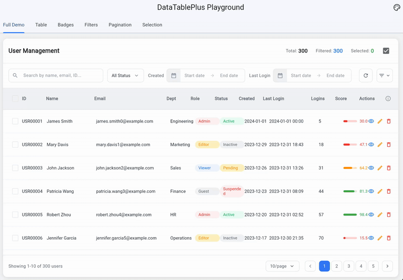
The example/ directory contains a full playground app with 7 tabs demonstrating every feature:
- Full Demo — Complete user management table with contextual bar, filters, pagination, selection, and badges
- Table Options — Interactive toggles to explore all DataTablePlus properties
- Badges — All StatusBadge variants and CountBadge
- Filters — Every filter widget individually and as a complete toolbar
- Pagination — Adjustable pagination with all options
- Selection Bar — Configurable selection bar with sliders
- Context Bar — Interactive toolbar ↔ contextual action bar demo with delete and select all
Run the example:
cd example
flutter run -d chrome
Requirements
- Dart SDK: ^3.0.0
- Flutter: >=1.17.0
License
MIT License - see LICENSE for details.
Libraries
- composable_data_table
- A customizable data table widget for Flutter with selection, pagination, and theming support.