Color Slider
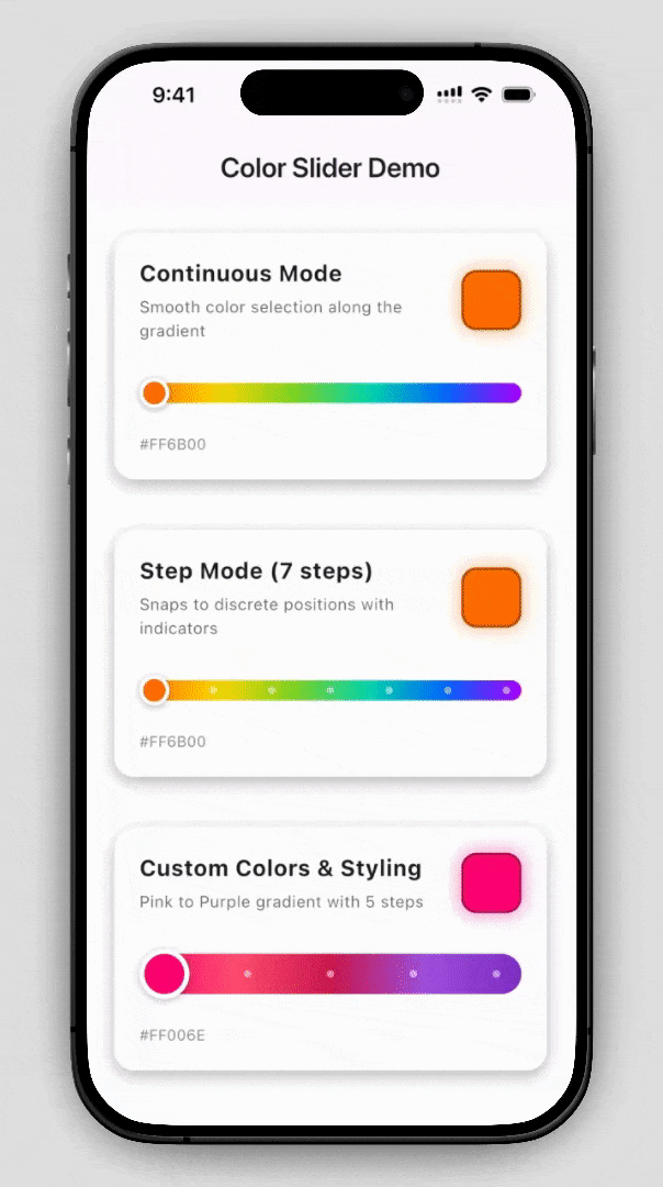
A customizable Flutter color slider widget for picking colors from a gradient spectrum. Supports both continuous and step-based selection.
Installation
Add to your pubspec.yaml:
flutter pub add color_slider
Then run:
flutter pub get
Quick Start
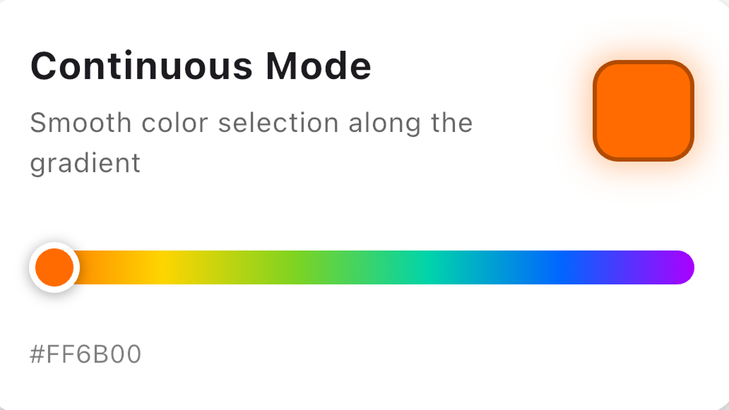
Continuous Mode
import 'package:color_slider/color_slider.dart';

ColorSlider(
  onChanged: (color) {
    print('Selected: $color');
  },
)
Step Mode
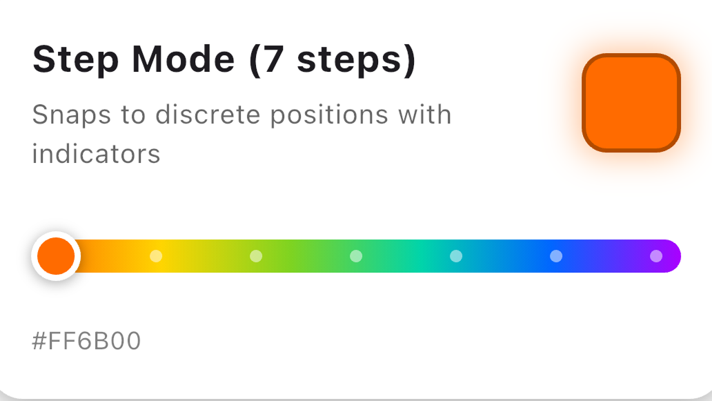
ColorSlider.steps(
  steps: 7,
  onChanged: (color) {
    setState(() => _selectedColor = color);
  },
)
Usage Examples
Custom Gradient Colors
ColorSlider(
  colors: const [
    Colors.red,
    Colors.orange,
    Colors.yellow,
    Colors.green,
    Colors.blue,
  ],
  onChanged: (color) => print(color),
)
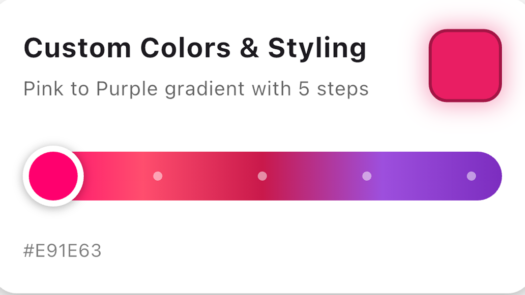
Step Mode with Custom Styling
ColorSlider.steps(
  steps: 5,
  colors: const [
    Color(0xFFFF006E),
    Color(0xFF9D4EDD),
    Color(0xFF7B2CBF),
  ],
  showStepIndicators: true,
  stepIndicatorRadius: 4.0,
  stepIndicatorColor: Colors.white54,
  onChanged: (color) => print(color),
)
Full Customization
ColorSlider(
  colors: const [Colors.pink, Colors.purple, Colors.indigo],
  initialColor: Colors.purple,
  height: 20.0,
  thumbSize: 32.0,
  borderRadius: 10.0,
  thumbBorderWidth: 4.0,
  thumbBorderColor: Colors.white,
  padding: const EdgeInsets.symmetric(vertical: 12.0),
  onChanged: (color) => print(color),
)
API Reference
Constructors
ColorSlider() — Continuous Mode
Creates a slider for smooth, continuous color selection.
ColorSlider.steps() — Step Mode
Creates a slider that snaps to discrete step positions.
| Parameter | Type | Required |
|---|---|---|
steps |
int |
Yes |
Common Parameters
| Parameter | Type | Default | Description |
|---|---|---|---|
onChanged |
ValueChanged<Color> |
required | Callback when color changes |
colors |
List<Color> |
Rainbow spectrum | Gradient colors |
initialColor |
Color? |
First color | Initial selection |
height |
double |
16.0 |
Track height |
thumbSize |
double |
24.0 |
Thumb diameter |
borderRadius |
double? |
height / 2 |
Track corner radius |
thumbBorderWidth |
double |
3.0 |
Thumb border width |
thumbBorderColor |
Color |
Colors.white |
Thumb border color |
padding |
EdgeInsets |
vertical: 8.0 |
Touch area padding |
Step Mode Parameters
| Parameter | Type | Default | Description |
|---|---|---|---|
steps |
int |
required | Number of discrete positions |
showStepIndicators |
bool |
true |
Show dot indicators |
stepIndicatorRadius |
double |
3.0 |
Indicator dot radius |
stepIndicatorColor |
Color |
Color(0x80FFFFFF) |
Indicator dot color |
Example App
See the example directory for a complete demo app.
cd example
flutter run
License
MIT License — see LICENSE for details.
Libraries
- color_slider
- A customizable color slider widget for Flutter.