📦 app_theme_kit
A reusable Material 3 theme package for Flutter apps with customizable color schemes, text styles, subthemes, and spacing constants.
Quickly set up consistent colors, typography, spacing, and component themes across your Flutter applications.
✨ Features
- 🎨 Customizable color system via
AppColors - 🌗 Light & Dark themes (developer-defined colors)
- 🔤 Custom TextTheme using Google Fonts (Quicksand)
- 📏 Design tokens: spacing, radius, elevation
- 🃏 Subthemes included:
- AppBarTheme
- CardTheme
- TabBarTheme
- NavigationBarTheme
- BottomAppBarTheme
- 🧱 Material 3 support
- 🧪 Example app included (with Light/Dark switch toggle)
🚀 Installation
Add to your pubspec.yaml:
dependencies:
  app_theme_kit: ^0.0.9+1
Then run:
flutter pub get
🛠 Usage
Import the package:
import 'package:app_theme_kit/app_theme_kit.dart';
🎨 Define Your Own Colors
You are not forced to use static colors from the package.
Define your brand colors and inject them into the theme.
final lightColors = AppColors(
  primary: Colors.teal,
  secondary: Colors.orange,
  background: Colors.white,
  surface: Colors.grey.shade50,
  error: Colors.redAccent,
);

final darkColors = AppColors(
  primary: Colors.teal.shade200,
  secondary: Colors.orange.shade200,
  background: const Color(0xFF121212),
  surface: const Color(0xFF1E1E1E),
  error: Colors.red.shade300,
);
🧱 Apply Theme to Your App
MaterialApp(
  title: 'My App',
  theme: AppTheme.light(colors: lightColors),
  darkTheme: AppTheme.dark(colors: darkColors),
  themeMode: ThemeMode.system,
  home: const HomePage(),
);
🌗 Light / Dark Toggle (Example App)
The example app demonstrates switching themes using a Switch widget:
Switch(
  value: isDarkMode,
  onChanged: (value) => isDarkModeNotifier.value = value,
);
This keeps theme control inside the application, not inside the package.
🔤 Typography Showcase
Text("Display Large", style: Theme.of(context).textTheme.displayLarge),
Text("Title Medium", style: Theme.of(context).textTheme.titleMedium),
Text("Body Medium", style: Theme.of(context).textTheme.bodyMedium),
✅ All text styles use GoogleFonts.quicksand by default.
🧩 Subthemes
- Cards
Card(
  child: Padding(
    padding: const EdgeInsets.all(AppSpacing.md),
    child: Text("Styled by AppCardTheme"),
  ),
);
- TabBar
DefaultTabController(
  length: 2,
  child: Scaffold(
    appBar: AppBar(
      bottom: const TabBar(
        tabs: [Tab(text: "One"), Tab(text: "Two")],
      ),
    ),
  ),
);
- NavigationBar
NavigationBar(
  selectedIndex: 0,
  destinations: const [
    NavigationDestination(icon: Icon(Icons.home), label: "Home"),
    NavigationDestination(icon: Icon(Icons.settings), label: "Settings"),
  ],
);
- BottomAppBar
Scaffold(
  bottomNavigationBar: BottomAppBar(
    child: Padding(
      padding: const EdgeInsets.all(AppSpacing.md),
      child: Text(
        "This BottomAppBar uses AppBottomAppBarTheme",
        textAlign: TextAlign.center,
      ),
    ),
  ),
);
📏 Design Tokens (Spacing & Radius)
Padding(
  padding: const EdgeInsets.all(AppSpacing.md),
  child: Container(
    decoration: BoxDecoration(
      borderRadius: BorderRadius.circular(AppSpacing.radiusMd),
      color: AppColors.cardBg,
    ),
    child: const Text("Consistent spacing & radius"),
  ),
);
✅ Use AppSpacing for padding, margins, radius, and elevation to keep your UI consistent.
📲 Example App
An example app is included in the /example folder.
Run it with:
cd example
flutter run
It demonstrates:
- Light/Dark themes
- Typography styles
- Cards, TabBar, NavigationBar, BottomAppBar
- Spacing tokens in action
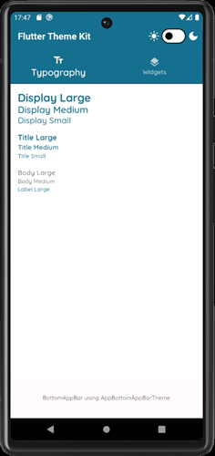
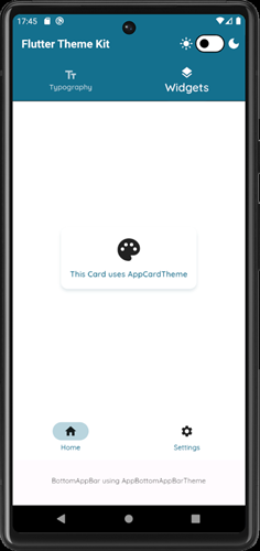
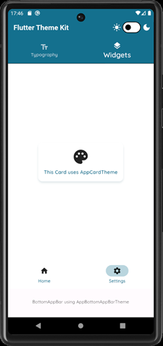
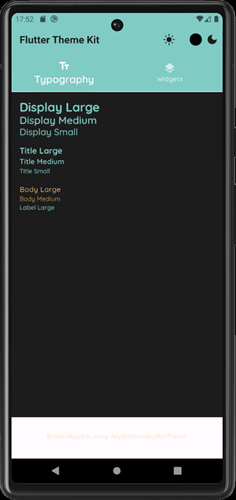
📷 Screenshots
Typography
Home
Settings
Dark mode
🤝 Contributing
Contributions are welcome!
- Open issues for bugs/features
- Submit PRs with improvements
- Share ideas in Discussions
📄 License
This project is licensed under the MIT License.
See LICENSE for details.